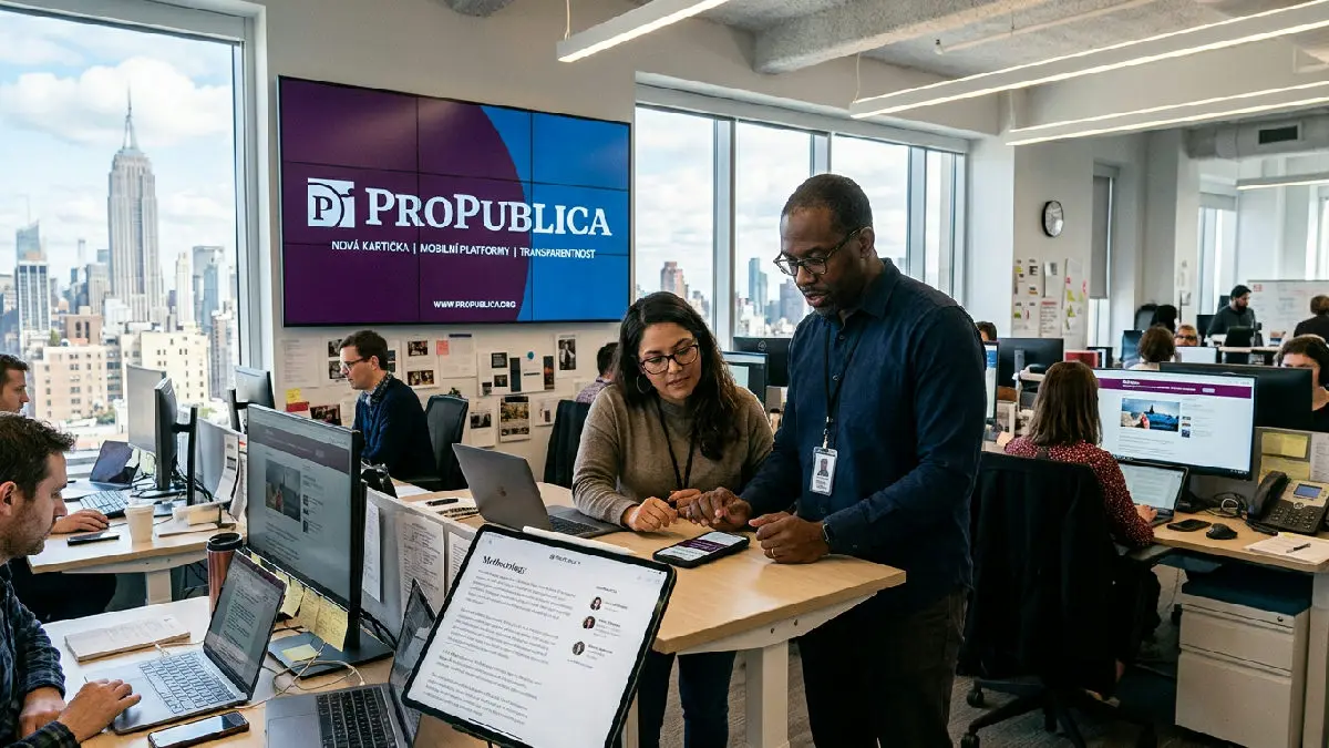
The non-profit investigative organization ProPublica on Tuesday launched an extensive redesign of its visual identity and web presentation. The goal of the changes is to unify the appearance of content across various channels, from websites to platforms like Instagram and Apple News. The redesign includes a new logo, modernized fonts, and an adjusted color palette.
According to the newsroom's management, the previous visual elements were outdated.
“Our previous visual identity was created for a different era. It was developed before mobile phones and social networks became ubiquitous,” explained Tyson Evans, ProPublica's product director.
The organization collaborated with branding studio Gretel on the new look.
However, the changes are not just aesthetic but also affect the website's structure. The main page now allows for better linking of investigative texts with supplementary materials, such as visual explanations, methodology descriptions, or guides for securely sending tips. The newsroom is thus responding to the need to show the public the complexity of its work and facilitate orientation in extensive cases.
The new website design places greater emphasis on transparency and interaction.
“Information about our journalists and partners, including their photos and secure contact details, is now more visible alongside articles,” Evans stated.
More prominent space has also been given to translations into foreign languages and audio versions of reports.
The current homepage utilizes a new color element in the form of a plum banner, which highlights current achievements, such as winning a Pulitzer Prize. At the same time, the website now presents selected cases from the archive, such as investigations of the FDA and USAID from 2025. ProPublica plans to continue incremental adjustments and improvements to the user interface in the coming months.